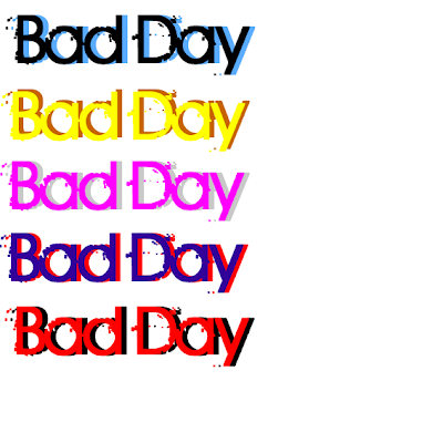
These are some colours have come up with for my font and I am going to ask what my audience which one looks best and which on looks more appealing to them and also if they have ideas on the colour of my font. I have picked to do two colours for my font, because it can show two sides of my character in the video as it can show her emotions as at first starts out angry and depressed but gets happier, also the two colours really standout from on another and also make the font look better as well. the colours of the font must all appeal to both male and female audience as they are my target audience. So these are some colours I have come up with which are both modern and contemporary which should relate back to a modern audience but also appeal to everyone at the same time. I will ask my audience for feed back on my colours and there input can make my products better because its what they want.
No comments:
Post a Comment