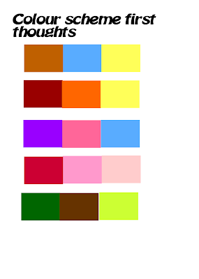
These are just some colour scheme ideas I have been thinking about for my CD cover and my poster as part of my digi pack as I want something that will link all the products together to show they relate to one and other. This also gets me thinking about my CD and poster, as I may in the end use a scene from the video for the cover and poster which will definitely link them all together, as I have already chosen my font I am using on both products as well. If I do go for the scene idea I will also edit it as well so I may need a colour scheme, but maybe a colour scheme from my actual video so then all of my three products will be linked together which is something I am trying to do. Another idea I have for my CD cover is that maybe have a background of paper to link to the teenage character with writing all over it and maybe with the lyrics, so the products are linked further together, and the scrap piece of paper can also be a personal symbol and again, something a teenager would do in real life writing when they are mad about something.
No comments:
Post a Comment