Tuesday, 26 October 2010
Filming- done!
Monday, 25 October 2010
Filming- done!(nearly there)
Sunday, 24 October 2010
Meeting with the characters- sorting things out
Friday, 22 October 2010
What I am doing now ??
Thursday, 21 October 2010
Props- Car
Wednesday, 20 October 2010
Props- the letter
Mock up further on
Monday, 18 October 2010
Mock up CD cover
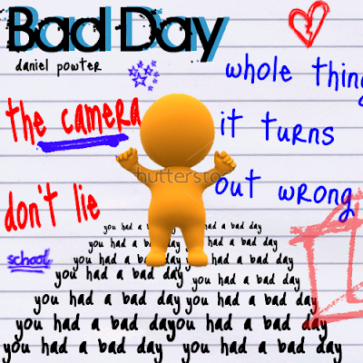
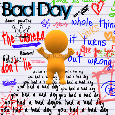
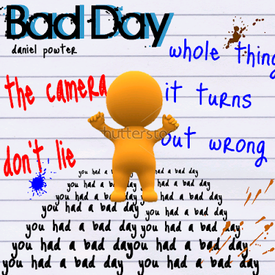
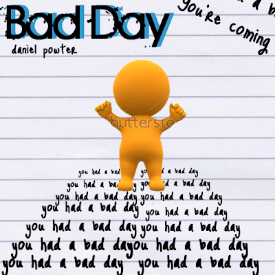
This is my CD mock up further on, and it a lot more developed as it has doodles on it just like a normal diary type page would have on it and it shows my characters feelings and emotions as it has things that are actually in my music video, like the school letter and the heart and stars are to represent hope etc to show that there is something happy in the music video. Also the box and lines is something a teenager or anyone does when they are bored or angry at something, which again relates back to the music video. I think I will be adding a shot of my actress on the next one and keep improving it as I am going along and also my two products are linking very well together they are relating together, also my CD is relating more as it shows things that are in my music video so it give insight into my music video.
Sunday, 17 October 2010
what I need now??? - equipment!!!
Anamatic- nearly finshed now
This is my anamatic again and this time ist very near finshed I think because it fits to the song now and we get 2D prepestive of my reall music video will look like and with an anamatic you can what works and what doesnt, but with an anamatic it lets you see how to edit things by putting in speical effects or the different transistions avaiable and give some basic skills I will need to edit my own reall footage. My anamatic looks good as it shows what I want my music video to look like, but I can also change things as well if I want to as I am still able to develop my ideas from this anamatic to my actuall footage.
Feedback on CD mock ups
Friday, 15 October 2010
CD mock up- further ideas
Thursday, 14 October 2010
Feedback on top issue
Clothing- causal (top 2)

Wednesday, 13 October 2010
Anamatic- improved
This is my anamatic but now it has a title at the beginning so it gets me use to putting titles on, but I have also edited little bits of the anamatic and now it actually fits to the music through my editing. I have also added some more transitions and also edited the time some shots on for. So, this anamatic is much better and more improved, it also it shows my what my music video may look like in the actual footage.
Mock up- first one- ideas etc
What I have I done today???
Tuesday, 12 October 2010
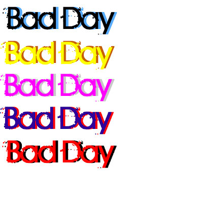
Feedback on my font colours
Ashleigh:I like the first one and last one as they really stand out ,but I would go with the blue and black one its better and really stands out and its really good to use for your music video and its also very modern to use as well.
Kris:I think out of the colours the first one is the best one and it can appeal to both sexes fits in with the emotions idea and it also looks very effective and update to use. The two colours also look very good together.
Rachel: I really love the first one its the best one, it really stands out and it really does link in well the sadness and happiness in the music video, but the main thing its really modern and fresh its something different from the original and it looks really good with the font.
Jack : my choice is between the first one or the last one both of them are really good and really stand out and think its the black as it really makes the the other colours stand out , and it links well with the themes of the video you are trying to show as well.
Alex: I like the first one as I can clearly read it, it also relates back to the music video as well with the darkness on it. It really stand outs from the others and would stand out in the crowd as well.Monday, 11 October 2010
Font colours
Sunday, 10 October 2010
Shoes- formal

Shoes- casual

Prop 2 - water gun

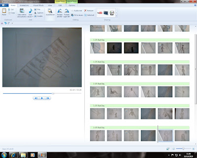
Me making my anamatic
clothing- casual (top 1)

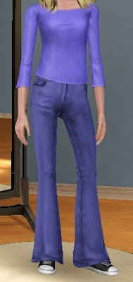
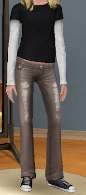
clothing- casual (jeans!)

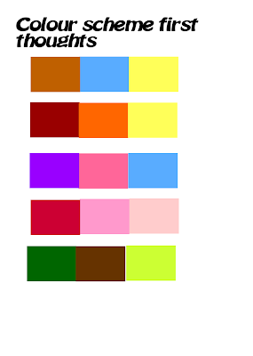
Feedback- on colour schemes and my ideas
Hayley: I really like the first colour scheme as its colours that could be in the music video but also because it looks very com temporary and modern so this would mean it would relate back to the audience as well. I also think you other two ideas are really good as one is directly linking the products together as a scene would be good, but I also like the less conventional method as its different and would make it stand out, but also it relates to the characters feelings and emotions but also the letter in the video you plan to use.
Stephen: I like the fifth colour scheme as it links to the natural things in the music video you are going to have and the locations you are using, but also it can link to he characters emotions as well so it will link them together. I also like the idea of the scarp paper background and writing over it as it will show how the characters feeling but also it can show that its personal, and this can relate to teenager and the audience you are trying to attract. The scene idea is good also, but it seems to similar to the original so I would choose the different idea.
Abby: I like the second and fifth colour scheme as these colours are attractive yet they can relate back to character and locations used in the video, I do like the different idea of the scrap paper as its something personal and relates to how the character is feeling. The scene idea is good too but you have to a pick a good scene out the video that can be used for both. Overall I like what ideas you have and they can turn out really professional but also great.
Jack: The ideas you have are really good so far so all you need to do is develop your ideas, the colour schemes are good as well I like the first colour scheme its modern and can relate to your audience as well. I like both the ideas of the scene and scrap paper background although the scene idea could be seen as the original but I really like something different so you could put your twist on it.
Naomi: I like the first colour scheme as well, but I also the like the fifth as it can be taken from your weather and locations to link the products together, but also both colour schemes can show the characters emotions as well, the other two ideas you have are great too. I think I prefer the scarp paper idea than the scene idea its been done before and I want something different.
Overall, this is great feedback from my audience as they have picked a colour scheme that I have come up with but also they like the other ideas I have from my poster and CD cover and that I am heading in the right direction and they are seeing where my colour schemes have come from as well.
Friday, 8 October 2010
Colour Schemes- ideas
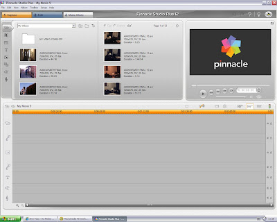
The pinnacle studio editing- learning
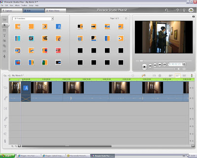
This is a screenshot of me looking at the transitions, and there are a wide variety and that can have different impacts on my music video but also shows me dragging in the transitions to the footage, I am allowed to practice on for my own editing purposes to help me gain the key skills I need. This also allows me to see the different transitions I can use, but also which ones are suitable for my genre of music, as some are more childish with paper planes etc but then are normal ones wipe out and dissolve that I could use in my music video.
This is a further screenshot where I am able to actually shorten the footage, I have so it will then fit in with music and will long enough for my music I am using in the video but also it allows me to see if I can actually fit the lyrics to certain points in the videom, to link both lyrics and the video together. This is something really good that I will be using a lot in my music video editing stage as I may have a lot of footage more than I need.
Thursday, 7 October 2010
Anamatic - added things to it
This is my anamatic with a few things added to it so its better than it was and its starting to fit with the music more, and it really shows how I want my music video in real life and this 2D anamatic is a very useful, as I can see problems with it but also the good things about it and at this stage I still change part of it and keep adding things as well. This is my anamatic further on, and more developed and looks better as well but I think I can still improve it further.
Formal clothing- decided for actress

Prop 1 for the video

Wednesday, 6 October 2010
What happened today?
Tuesday, 5 October 2010
anamatic 3
This is my anamatic further on with all my shots I am going to use but also it has some transitions, and with my feedback its been improved to my audiences liking and also it has the music I am going to use for my music video on the anamatic, so I will actually know in 2D what its going to be like and it also gives me more ideas which shots to include and which to not to improve it even more.
feedback
 I asked my target audience at the end of my storyboard what they thought my storyboard was great, and that my music video from my storyboard and the shots and ideas I have and the story I have is really good and they all said that they can relate to the situation that is going on and feel sympathy for my actress, the only thing they suggested that I could make more references back to the music itself by maybe some shots of the instruments itself, so from my feedback from people I have asked I am going down the right track for my music video and the story is great , but I must include shots of an instrument that is being played in the song. So this is what I have drawn to be added to my storyboard, and my anamatic so with improvements and feedback from my target audience I can see what they want and what will make my music video very entertaining to watch.
Monday, 4 October 2010
Clothing sketches- formal
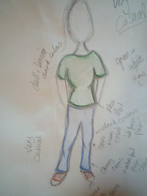
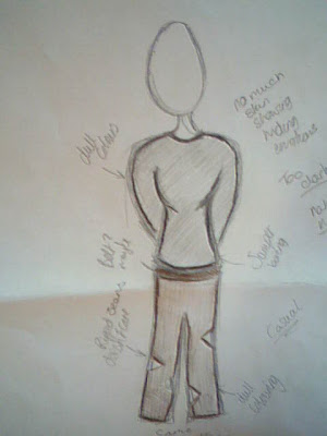
Clothing sketches- causal
Anamatic 2 very rough
This is my anamatic but its still very rough but has more shots and I have also added music to the anamatic, and this is to show how my music video would look like in 2D and very rough but my next one will be better with more effects and editing on it I just first thought it was best to put some music and more shots on the anamatic.Also it shows my drawings altogether as well.
Storyboard last shots
Sunday, 3 October 2010
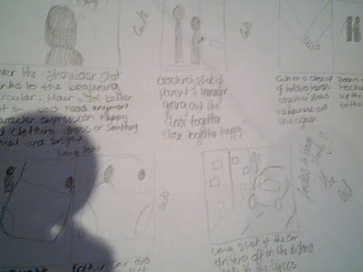
Storyboard- last shots now
Parent character- chosen

Main actress- chosen

Final location

locations
 These are the doors that I will be using for my music video as this is a key part in my music video, as you think that she is going to go back in the house when she comes back but instead shes goes straight back out again ,which again shows she is trying to distance herself from the house and its the family and links to the idea of getting away from the parent and the fact that the doors are completely different shows what she is thinking inside compared to what the audience thinks is going to happen in the music video. The doors can further show us her feelings as the front door is big and is barley see through, can show us her rage and anger that's there, and
  the other door however is just glass and its see through showing the door can show that she has changed a little to being more relaxed, and more calm and because its a door you need a key etc to link with her opening up her emotions finally.
More locations

 This is the street I am going to use for the shot where we see her walking away in the distance and she is trying to distances herself away from the house and the parent inside, which can relate to my audience as this is something most teenagers do and it can show how really angry she is, also this is the street that will be used for when she comes back and she seems to have blown of some steam and seems a little bit happier.
Locations


This is the place I will want my actress to trip when she storms out of the house showing these bad things are still come which happens in my music video as she continues to have a bad day until the end. But not in between two cars though as that would be dangerous just the one, as the silver one is the key element in the driveway but the audience wouldn't know this.
This shows both my prop that is a key element in my music video but also shows a new location and hopefully when it is shot it will have sunshine on my actress so it will look nice but also play with the irony idea that I have always the through my music video.
clothing( glamorous/less causal)- first ideas
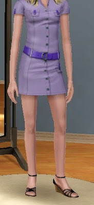 for my music video.
clothing (casual)- first ideas
 n so it can relate back to my audience.
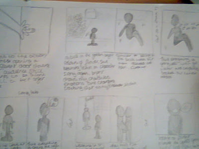
Storyboard - sheet 4
storyboard sheet 4- nearly there
Saturday, 2 October 2010
Anamatic- very rough!
These are the first six shots of my music video and this is a very rough anamatic as it has no music with its, as its more of a playing around with the software and getting use to it also learning the different things I can do with this, this is just a rough piece of work but it can also give me ideas for my anamatic and what transistions I can use but also zooming in and out as it will also give me ideas for my actually product, also I can change the duration of the shot before a cut or transition. It also gets me use to editing my pieces of work which will help me in the future with my final product. An anamatic is a good way of shwoing of what you want your final product to look like and you can also change it slightly as the anamatic isnt the final product.
Props- what I am going to need!
Piano/keyboard- as I am aiming for my product to also link to the music as well I think I should have someone playing the piano or a close up of someone playing maybe, so it links back to the music and also to show its about the music as well as the story in my music video.
Envelope and letter- this is a very key element in my music video as this is what stirs up the bad things to come in my music and its a turning point in my video so this is something that is key in my music video
Car- at the end of my music I am going to try a get a shot of a car pulling out of the drive so it links with the lyrics 'go for a drive' and this is a key element as well, as it links directly with the lyrics as my music video is more story like it links all the way through but this is something that will directly link to the exact lyric as it is said at that time.
A water device (watergun I think??)- This is somthing that will add a bit of humour as I am going to get my actress to get soaked by water, but she smiles about a bit more and adds a bit more of a happier atmoshpere to it and entertains the audience.
These are some of the things I am going to need to make my music video sucessful as it will add bith tension but also humour from some of my props, I am going to use in the video so my audience is kept entertained by the story but als some of the humours events that happen as well, but also linking the lyrics to the video and the music through my props.
Friday, 1 October 2010
Storyboard sheet 3! detailed!
The Pitch today!!!
Overall my music video is looking good and that I should just continue how I am, and also keep adding more ideas along but also my music video is going to look very good and I was able to get feedback from my target market.


