Tuesday, 30 November 2010

2nd Draft of music video

2nd draft of my music video from amy pass on Vimeo.

This is my second draft of my music video where I have included my music to it now, so I can start sorting out the timing of certain places so the lyrics are said etc. Also I have added effects, transitions and more cuts to the piano so the whole thing is linked together. Now I have been able to upload my video I can now ask my target audience what they think about my music video and what I should do to improve it or add to it, also asking if they actually enjoyed the music video and if they could relate to it. This is my second draft of my music video so I am improving it even further so its better and more professional.

First draft rough cut without any music

Rough from amy pass on Vimeo.

This is my first draft of my music video without any real editing and without any music. Shows I have all my footage and its all in order now. My video has been uploaded now and this shows that editing is needed on my music and also the music needs to be added to it show it all links together.

Monday, 22 November 2010

What I am doing now?

I am uploading my music on the my first draft of my music video and now I have signed up to vimeo, so now I can actually upload my first draft of my music video on there and transfer it on to my blog so everyone can see it can give me contrustive feedback on what I should do next and how I can improve my music video, to make it look better and fit in with genre, music and lyrics etc.

Friday, 12 November 2010

Put my footage togther!!


I have put all my shots together in the correct order I want them to go in to fit in with my ideas and planning but also the order I want my story to go in and to fit with my lyrics of the song.
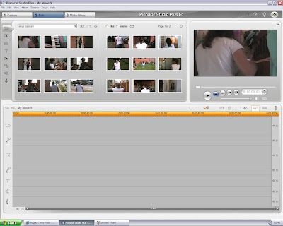
This is a screen shot of my footage all together an showing me editing the length but also putting in my transitions into my footage as well. I am also adding my piano in as well to cut some of the shots, because I think some of them are a bit long but with the piano it links back to the music and makes it seem more of a music video.

Tuesday, 9 November 2010

Poster- ideas(layout)


This could be one way I could have my layout of my poster as I could have the same layout as my CD cover as well with the title at the top which would link all my products together ,and having a white background would also link them together as well, but maybe I could do something different may have the Bad Day placed at the bottom or on a tilt so it can be something different but having the same font etc would link them all together. Maybe have my actress actually showing her face on it and the text all around her instead of having an actual shot from the music video.
This is my other layout I have come up with 'Bad day at the bottom of page its something different, and may I could move it over more to left or right so I can place a picture behind it and have different effects on the poster and the picture I will use for my poster but maybe it would be better at the top as people would be able to see it better than at the top. This is something I could be trying to play around with to get what a want, but also asking my target audience as I am going along as they are the most important people as they will be the ones viewing my music video and my other 2 products.

Monday, 8 November 2010

Poster- ideas

I have also make a poster for a my digi pack as well, its something that has to be linked with the music video and the CD cover as well which is something I am still doing. The poster is bigger and the same font will be used on the poster as used on the CD cover as it will be something that will link the products together so now its all about the idea I could use the same exact thing on my CD cover that's there with the scrap paper idea and use the same images as well so its really linked together with the same layout or I could do something different from my CD cover but still have the same ideas involved. Another idea, could be to do something completely different from my CD cover but still linking the products together. An idea I have had is use the actual image from the CD cover, but having the background on as well and not the lined paper background and still have he the doodles on it as well which would be the same idea but something different and still have the products linked together.

Friday, 5 November 2010

What I have been doing?

I have been playing around with my music video and have put it together and now I am putting in some transitions into it and see how they look on the footage and if they fit in with my ideas, also I haven added some effects ,and I have also been gradually cutting down some of the footage as some of the footage is from something else but also cutting it down the shot so they are shorter but also to fit in with the music, so I have been cutting down and putting my music video together very rough though at the moment but gradually bring ing it all together.

Tuesday, 2 November 2010

What has been done today????


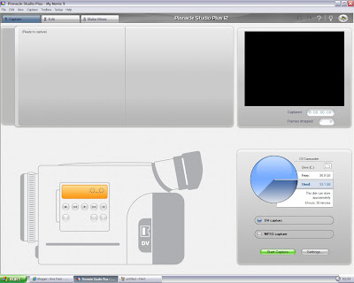
I have uploaded my music video today and now its time to start editing my raw footage with all the shot I have taken now its just getting the editing right for my music video. This is a screenshot showing I am uploading my music video footage for me now to start editing it with different effects and transitions to make the music video feel right for audience and create the right mood as well.


This is my footage now ready for me to play around with and get my music video perfect and how my audience want it and to make it look professional but also entertaining for my audience to watch, all I need to do now is start editing and actually add my music file in to the editing programme so now I can really get to grips with editing it.

So now I am all set and focused on creating a great music video.